Prediction of the daily production of solar panels
This project was made part of Data Science Project course at UTBM. We worked over 6 months by functioning as a mini Scrum Team in a company by covering all aspects of project management (human resources management, budget management, specifications, planning, business model, P.I., communication…) and the entire development process to produce a complete software application.
Our work and investment led to a meeting with a startup incubator to whom we could present our project. Here are the steps of its creation.
Open Data
We started from scratch. We had to find a need and associated data or the other way around.
We chose to use open data because, at our level, it is much easier to access than proprietary data. Furthermore, another important criterion that justified our choice is the interoperability of open data. This condition guarantees our ability to mix different data sets.
During our research, we came across a report from UK Power Networks, which is an electricity distribution system operator covering southeast England, eastern England and London. This report follows a feed-in tariff scheme introduced by the UK to encourage electricity generation using small-scale systems (≤5MW).
Adoption of small-scale PV installations has been rapid. Tariff revisions in 2011 and 2012 spurred adoption, but caused short-term spikes in demand as installers rushed to commission systems before the reduced tariffs took effect.
UK Power Networks therefore launched this project to ensure that its PV connection assessment tools, procedures and design assumptions were fair to customers, minimized the risk of negative impacts on the grid and incorporated best practice, on-grid knowledge and solutions available in Britain.
Data Description
The project collected a rich dataset from domestic sites with solar panels. The dataset includes 25,775 days of data and over 171 million individual measurements.
Key statistics from the dataset:
- 20 substations and 10 domestic locations
- 480 measurement days - July 27, 2013 to November 19, 2014
- 10-minute intervals throughout the recording period, one-minute intervals during the summer of 2014.
- 10-minute measurements prior to June 10, 2014, aggregated into hourly minima and maxima.
Data Analysis
We looked for missing values, analyzed the consistency and correlation of the data.

In order to efficiently identify the missing values in our portion of the dataset, we generated a matrix graph. This is a very good tool when working with time series data. It provides a colored fill for each column. When the data is present, the graph is shaded in gray, and when it is absent, the graph is displayed in white.
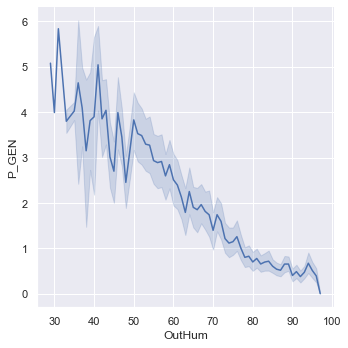
We notice, for example, that logically, outdoor humidity is negatively correlated with energy production.
Models
After performing the usual data cleaning and visualization steps, we tested the plausibility of our project to predict the electrical production of solar panels from weather data by implementing a simple linear regression model.
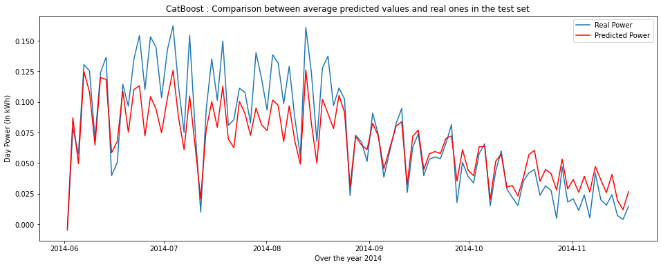
However, it was difficult for us to analyze our results based on metrics without any basis for comparison. This is why we decided to generate the graph below.
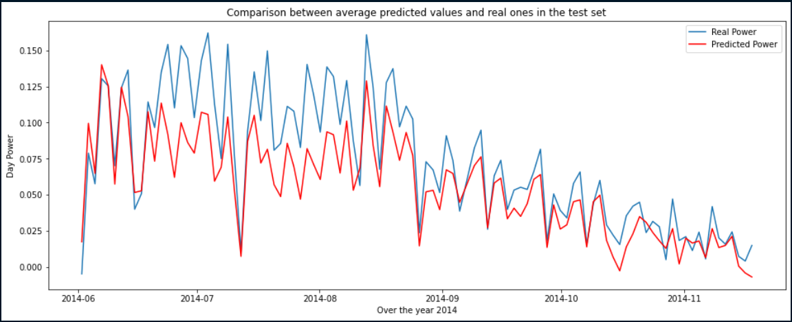
You will find above in blue, the real electric power and in red, the electric power assumed by our first model.
This first result satisfied and motivated us because it proved the potential of our project. It also allowed us to identify periods of the year when it worked better. For example, it was accurate from September onwards and unable to predict extreme production values in the middle of the summer.
Models Comparison
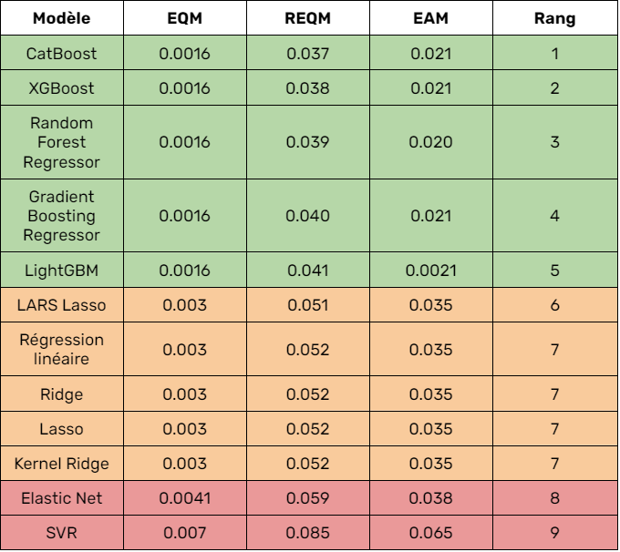
From these initial results, we can infer several things. First, as expected, the multiple linear regression model underperformed given its simplicity and the nonlinearity of the data. Second, models such as Ridge, Lasso, LARS Lasso, SVR surprisingly performed similarly to linear regression. By analyzing the optimal parameters of these models we realized that they performed better when the hyperparameter alpha was 0. That is, when their behavior was equivalent to that of linear regression. We therefore deduced that these models were not the most appropriate for our data set.
Moreover, we notice very distinctly the difference in results between the above mentioned models and others based on decision trees. As an example, we note that our 5 best algorithms are all based on random forest.
Thus, after identifying the models best suited to our data, we decided to optimize each of these models in depth by looking for the optimal hyperparameters.
Hyperparameters optimization
For example, for the CatBoost model the following parameter grid was used:
parameters = {'depth': [4,5,6,7,8,9,10],
                'learning_rate': [0.03,0.04,0.05,0.06],
                'iterations': [50,100,150,200,300,500,800,1000],
              'l2_leaf_reg': [0.2, 0.5, 1, 3]}
In concrete terms, we had to train our model with all possible combinations of these parameters. Here, in our case, we had to train 7 x 4 x 8 x 4 = 896 possible combinations.
Product development
Despite our training data based on England, we focused on France. Indeed, the existing correlations between our input data hold independently of the climate. Moreover, it was more convenient for us to work on France because it is a country we know well.
For the front-end we chose React and for the back end we chose Django.
In recent years, business models have shifted from product to service. Several reasons can be given for this. On the one hand, the strong growth of the digital economy and a greater awareness of customer needs have led more and more companies to focus on understanding needs and not just selling products. On the other hand, the evolution of services is part of a broader perspective. Fundamentally, the focus is no longer on the product, but on the purpose it serves - the problem it solves for customers.
That’s why we decided to sell the results of our model as a subscription.
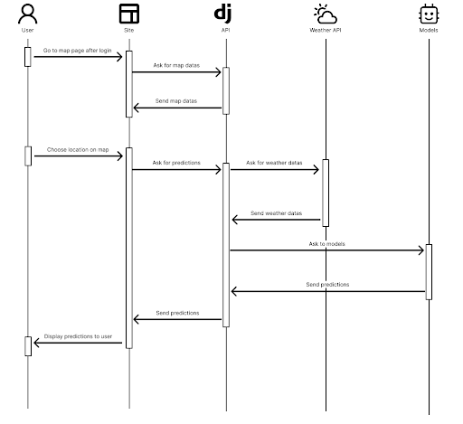
You’ll find above, the sequence diagram of the whole solution. As you can see we’ve connected our models to weather APIs. In fact, in order to make correct predictions on new region in France, we need the current of future weather in the region selected by the user. This is why we’ve connected the models to OpenWeather and Solcast APIs.
Video presentation
As part of the course, we had to produce a 3 minute video similar to the “Three Minute Thesis” exercise. The video below is in french but automatic english subtitles generated by Youtube are correct.
Used Software and Libraries
- Programming languages: Python
- Libraries: Scikit-learn, Catboost, XGBoost, Django, REACT
- Source control: GitHub
- Other tools: DataSpell, Jupyter Notebook